When the screen feels too small or hard to read
You usually notice it when you’re doing something simple: reading a text message in the grocery store, checking a recipe with the kitchen lights behind you, or tapping the wrong button because everything feels cramped. Sometimes it’s not just “small text”—it’s glare on the glass, low contrast in an app, or the screen dimming a little too aggressively to save battery. Other times the colors look washed out, or animations make things harder to track.
Before changing a bunch of settings, name the main problem you’re fighting: size, brightness/glare, contrast, or motion. That one choice will point you to the fastest fix and keep your phone from feeling “too big” or weird afterward. A practical constraint: the clearest settings can use more battery (brighter screen, heavier contrast) or fit less on the screen (larger text), so it helps to tune for your most common situations rather than aiming for a perfect look everywhere.
Make everything bigger with Larger Text and Display Zoom
If the main issue is that everything feels cramped, start with two settings that change daily usability fast: Larger Text and Display Zoom. On iPhone or iPad, go to Settings > Accessibility > Display & Text Size > Larger Text, turn on Larger Accessibility Sizes, then drag the slider until Messages, Mail, and most apps feel comfortable at arm’s length. This is the cleanest fix when you can read the screen, but only if you squint or keep zooming in.
If buttons, icons, and touch targets still feel too small, use Display Zoom. On iPhone, look in Settings > Display & Brightness > Display Zoom (or Settings > Display & Brightness > View) and choose the “Larger Text”/Zoomed option. It makes the whole interface bigger, not just words. The trade-off is you’ll see less content on each screen, and some layouts can feel more “stacked,” so aim for the smallest increase that stops mis-taps.
Zoom in anywhere with the Zoom accessibility tool
You’ll still run into moments where you don’t want the whole phone bigger—you just need a quick close-up of a map label, a price tag in a photo, or the tiny “terms” text in an app. That’s when the Zoom accessibility tool helps, because it works like a movable magnifying glass that can pop in and out anywhere.
Turn it on in Settings > Accessibility > Zoom. If you enable the Zoom Controller, you’ll get a small on-screen handle you can drag around and tap to zoom, change the level, or switch to a windowed zoom so only part of the screen is magnified. (Full-screen zoom is useful too, but it can feel disorienting at first.) A realistic downside: Zoom can make it easier to lose your place, especially when you’re scrolling, so start with a modest zoom level and practice on something low-stakes like Safari text before relying on it in a banking or shopping app.
Turn your camera into a reading aid with Magnifier
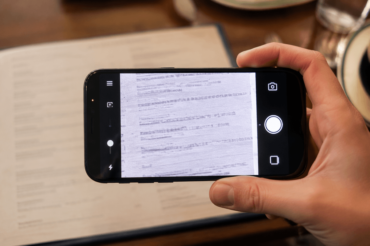
You’ll also hit situations where the problem isn’t the phone’s screen at all—it’s the real world. A menu printed in light gray, a thermostat with tiny labels, a medication bottle, or instructions on the back of a router. Instead of taking a photo and pinching to zoom, use Magnifier, which is designed for live reading. Turn it on in Settings > Accessibility > Magnifier, then open it quickly by triple-clicking the Side button (or Home button) if you’ve set it as an Accessibility Shortcut.
Once Magnifier is open, try three controls that make the biggest difference: zoom, brightness, and contrast. Use the flashlight button when lighting is the issue, and use filters to make faint text stand out (black-and-white often helps). If your hands shake a bit, look for the option to freeze the frame so you can read a still image without rushing. The practical trade-off is battery and heat: using the camera, screen brightness, and flashlight together can drain power fast, so it’s best for short bursts rather than long sessions.
Let your iPhone read aloud using Spoken Content
Sometimes the easiest fix is to stop forcing your eyes to do all the work. Spoken Content can read what’s on the screen, which is especially helpful for long emails, web articles, or any app with small, light text that won’t stay comfortable no matter how you tweak size or contrast.
Go to Settings > Accessibility > Spoken Content. Turn on Speak Screen, then swipe down with two fingers from the top of the screen to have iPhone read aloud. The on-screen controls let you pause, skip, or change speed. If you only need a sentence or two, turn on Speak Selection so you can highlight text and tap Speak. For a more “hands-free” feel, enable Typing Feedback so you can hear what you’re entering in a form or password field (useful, but not always ideal in public). The practical limitation is privacy: read-aloud is easy to overhear, so keep headphones nearby for waiting rooms, buses, and shared spaces.
Improve clarity with Contrast, Color Filters, and Invert
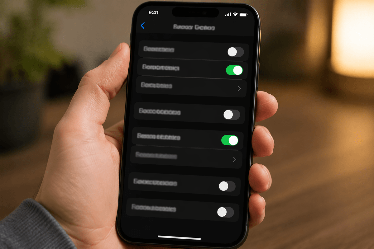
You’ll notice some apps are technically “big enough,” but still tiring—light gray text on white, thin icons, or a background image that makes buttons disappear. That’s a contrast problem, not a size problem. Start in Settings > Accessibility > Display & Text Size. Try Increase Contrast and reduce Transparency (or turn it off) to make labels and menus stand out more consistently. If motion is part of what’s bothering your eyes, Reduce Motion can also make screens feel steadier when you’re switching apps or opening panels.
If certain colors are the issue—links that don’t pop, charts you can’t tell apart, or “active” buttons you can’t spot—turn on Color Filters in the same menu and test a few presets. For quick, dramatic changes, try Smart Invert or Classic Invert; Smart Invert often works better because it avoids flipping photos and many media elements. The trade-off is accuracy: filters and invert can make photos, maps, and brand-colored buttons look “wrong,” so consider setting them as an Accessibility Shortcut so you can toggle them only when needed.
A quick setup checklist for your everyday viewing situations
You’ll get the best day-to-day results by setting up a few “go-to” combos you can reach fast. For always-too-small text: Larger Text + (if needed) Display Zoom. For quick close-ups inside any app: turn on Zoom with the Zoom Controller at a modest level so you don’t lose your place while scrolling. For real-world print (menus, labels): enable Magnifier and practice Freeze Frame; remember the camera + flashlight can drain battery quickly. For low-contrast apps: Increase Contrast, reduce Transparency, and try Reduce Motion if screens feel jumpy. For color confusion: set Color Filters or Smart Invert as your Accessibility Shortcut so you can toggle them only when needed.